Scroll for details

Making the Insurance Backstage Process Visible to Customers
Sunday Orderlist is a project aimed at helping customers track their insurance approval status more efficiently. With over 500 orders per month, this solution makes it easier for customers to track their insurance progress without relying solely on phone calls to customer support.
I led the overall design process in collaboration with a UX Writer, Product Owner, and Engineers, with support from my senior designer. This process covered from understanding customer problems to designing for implementation.
Insurance
UX Design
User Feedback
UI Design
Organization
Sunday
Role
Designer
Date
Dec 2023 - Feb 2024
Contributors


1 ~ Start with hearing the customer
Voice from customers
In our team, we conduct weekly phone interviews with customers who have purchased insurance to gather their feedback. From these conversations, we've identified consistent patterns and pain points:
Concerned about their insurance status
When purchasing, they were unsure about their insurance status, which led them to contact or call for an update.
Uncomfortable after complete payment
They felt uncomfortable because their payment had already been deducted. so they had to call for verification of the transaction.

2 ~ Backstage background
Lack of Transparency in Backstage Approval Process
The insurance approval process is multi-step and happens behind the scenes, hidden from the customers.
Customers are only informed of their approval status through emails or direct contact from the insurer.
This lack of transparency creates a pain point, customers are unsure which stage their approval is in.
This "backstage" approach keeps customers in the dark about the status of their approval.
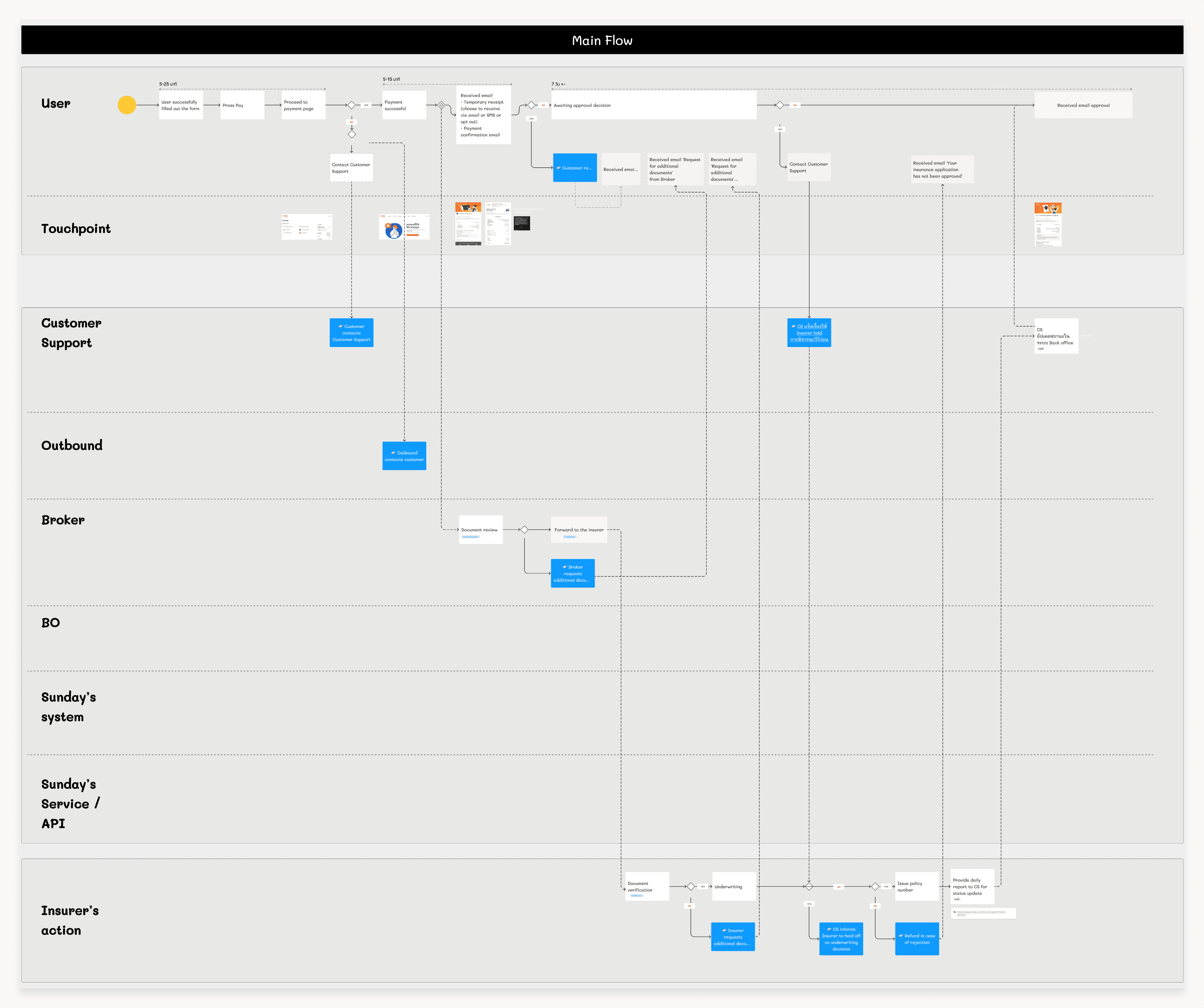
*This image briefly show the as-is customers flow and backstage processes in the insurance purchase journey.
3 ~ The problem we want to solve
The aim of this project was to address a pain point that lack of visibility into the status of their purchased insurance. We focused on enabling cutomers to track the progress of their insurance process and clearly see which stage of the backend workflow their policy is currently in.
4 ~ Concept statement
Making the backstages visible to customers.
In the backstages, once an order is received, staff update the status within the back-office system, which is used internally to track the progress of the approval process.
However, This system status is not visible to customers, which can lead to a disconnect between the backstage processes and the customer experience.
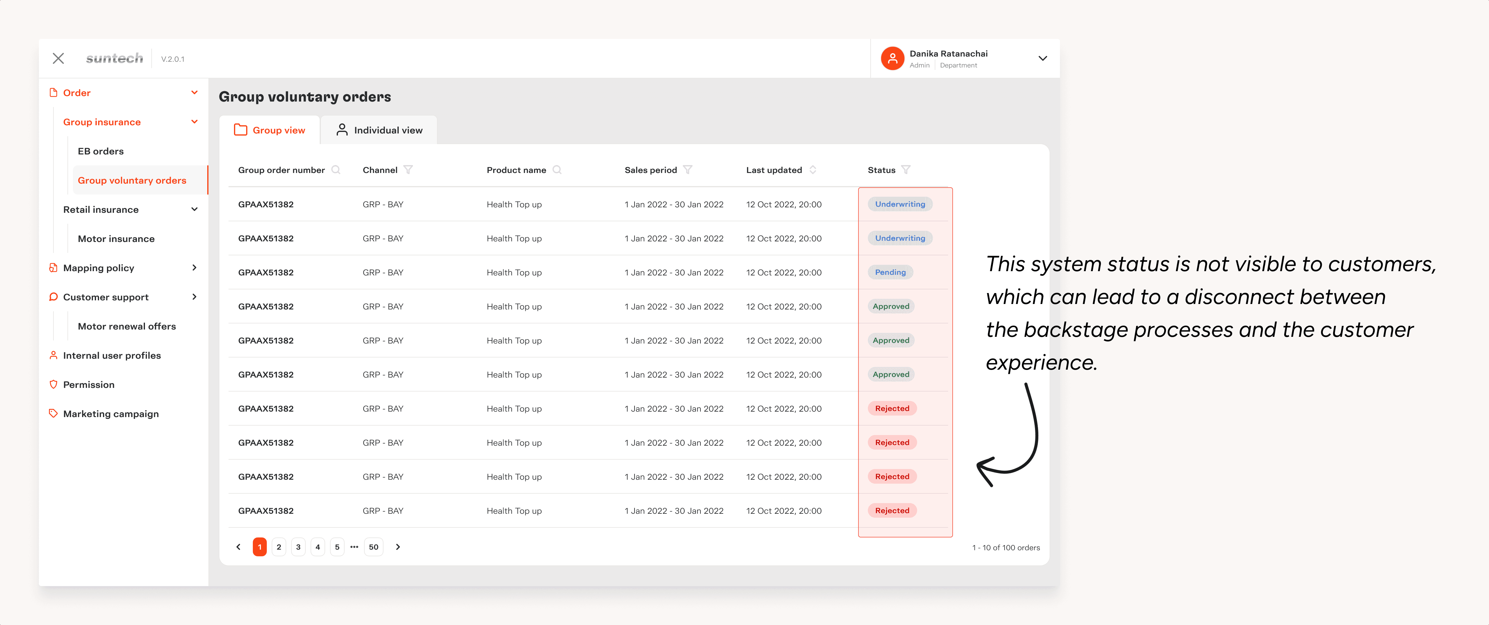
"Our concept aims to close this gap by making the back-office status visible, allowing customers to track their insurance progress in real-time."
Challenge
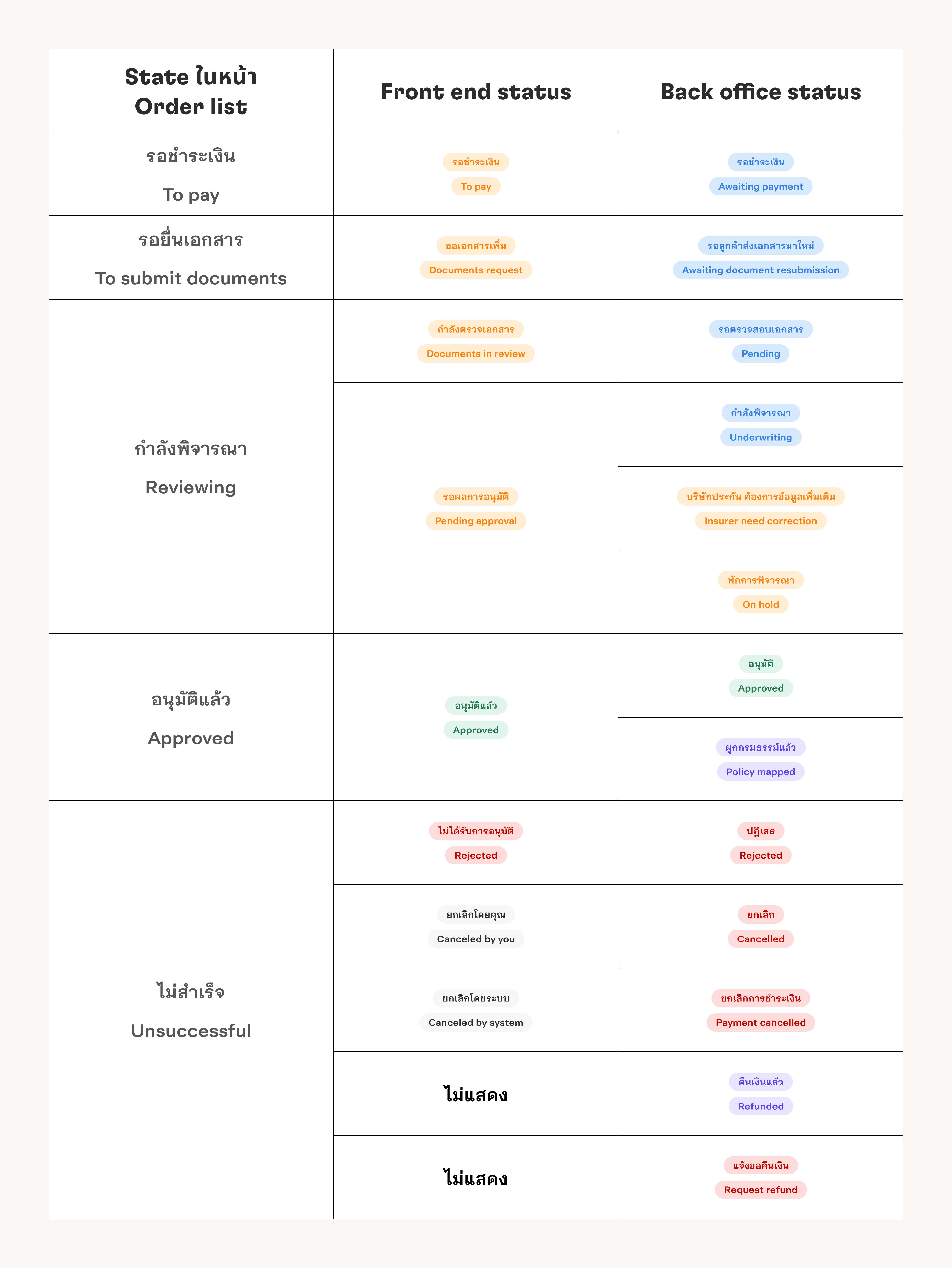
The backstage process contains many detailed statuses at each step.
To display these statuses on the front end for customers, we needed to map the back-office statuses to user-friendly terms.
We worked on defining how each back-office status would appear and be represented in the UI.
This required collaboration with key stakeholders, including: Product Owner, Back-office team, Underwriting team, Developers
The goal was to ensure the information shown to customers was both accurate and easy to understand.
How We Addressed It
We categorized the back-office statuses into distinct states, each with a corresponding front-end status for customers. This approach simplified complex backstage processes into clear, customer-friendly updates.
To Pay:
Indicates that payment is pending.To Submit Documents:
Appears when additional documents are required from the customer.Reviewing:
Covers statuses related to the review process, including checks by brokers and insurers. In some cases, the status may temporarily be marked as “On Hold.”Approved:
Represents situations where the insurer has approved the application and the policy is mapped.Unsuccessful:
Used when an order is canceled by the customer or the system.
One exception was refund processing, which not display due to varying policies across providers.
5 ~ Design
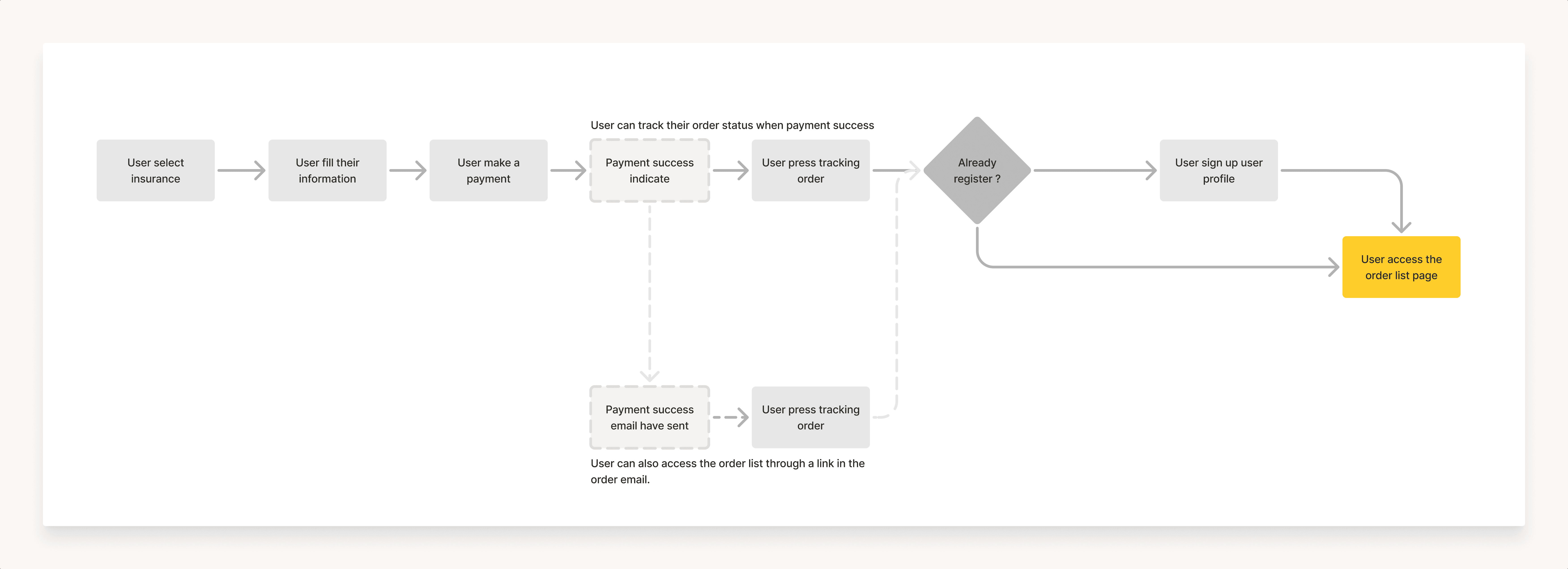
How customers access the order list
Customers can access through their insurance purchase flow, but they must first create a user profile.
The profile creation touchpoint is placed after the purchase to avoid interrupting the buying experience.
Customers can also access through status update emails sent to them at each stage of the process.
Finalizing Display Information
To determine what information to display on the customer card, we held a session with the Product Owner, Business team, and Developers. The discussion involved negotiation to ensure the displayed data was both comprehensive and useful for customers.
For instance, the Business team initially proposed including the transaction code, but we advocated against it, explaining it could confuse customers. Instead, we suggested relying on the order number or the customer’s name for tracking, which is simpler and more intuitive.

Collaborative design process
This Figma file showcases the design created in collaboration with the Product Owner (PO) and UX Writer. It’s ready for handoff to developers, ensuring aligning communication and clarity for implementation.
The file includes:
Desktop and mobile designs for both Thai and English
Wireflows to visualize user interaction
Detailed component anatomy with descriptions.
Annotation for each UI Element
Scenarios to guide development and testing

Designing for implementation
Customers can now track their order progress by creating a user profile, which provides access to the Order List page. This feature is now live in production.

6 ~ What’s Next and What I Learned
We tracked user behavior using Google Analytics and Hotjar to measure the user experience and monitored the flow and UI design for opportunities to enhance them.
The biggest lesson I learned was the importance of effective communication between developers and designers. Ensuring alignment between specifications and concepts is crucial to avoid miscommunication and deliver a seamless product.
Thank you for Scrolling. Hope you liked what you saw :)
Next up
